Tuesday, October 14, 2014

Working from Photographs (Part 2) - Make Technology Work for You

Artists have been using technology for centuries to further their craft. Be it the camera obscura or Adobe Photoshop, we have always found ways to improve what we do. I find that one of the biggest differences in my painting experience between painting from life and from a photo is getting lost in the small details. Its easy to do in a high-resolution photograph blown up on a 24" screen and when you don't have a model's comfort to consider its easy to forget the time and loose yourself in the process of overworking every little area. Yet, when painting from life it seems so much easier to see the subject as whole, block in the proper shapes and colors, and work towards detail as time allows.  So, how do we solve this problem? Obviously, paint from life! Except for when that isn't a realistic option, most of the time for me. So I'll take the next best thing: Photoshop.

Here's our beginning photo reference. Its fine as it is, good value scale, obvious light and shadow. But  there are also tons of little details one could get overly focused on. How do we fix that? 

The first thing I recommend after opening your image in photoshop is copying your image into a duplicate layer. Then open the Filters Gallery and select the 'Palette Knife' filter. Adjust your sliders as you wish, the larger the stroke size the blockier the reference photo becomes. 


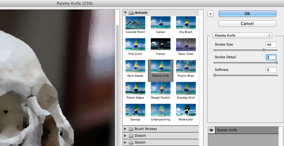
Once you've completed your adjustments you'll end up with a photo like this: 

A much more simplified version of the original. The value and temperature changes are more obvious with the details subdued. To me this feels as close to painting from life as I can get without having a model in front of me. 

As I progress through the painting and start layering I'll adjust the opacity of the knifed layer, slowly introducing the details back into the reference. 


Eventually I'll turn the knifed layer all the way off and allow myself to get lost in the details now that the structure of my painting is properly built.

Some may consider this cheating but I doubt they'd drill a hole with hand drill when they have a Black & Decker sitting on their workbench.


Thursday, July 31, 2014

Working from Photographs (Part 1) - The Difference a Camera Makes

When it comes to working from photographs there are as many opinions as there are artists. Some people work only from photographs, some would never even consider it, some would never admit it. Some of us, likely the majority, have no choice but to work from photos at least some of the time. My schedule with the fire department is odd by most standards, which means my painting time is sporadic and spread out across my days off. It is highly unrealistic to have a model sit for me at 5 o'clock in the morning for an hour before I go to work. So photographic reference it is! 

I'll spread out my thoughts and tips on making the process of working from photos work best for you out over a few posts. Today's post focuses on starting off with the best photo you can. The absolute best thing you can do to help yourself when working from a photo is to work from the best photo possible. This means spending some time (and money) learning how to get that. First off, buy a decent camera. Sure, we all have smart phones, and sometimes you snap some great shots, but for the purposes of creating a refined, detailed painting they just don't cut it. 

This is a photo I took in my studio of my friend and fellow painter Foster Grissim. At first glance its not a bad shot, but when you zoom in you see there are almost no details. 


Now compare that with the photo I took with my Samsung NX1000 with a 45mm F1.8 portrait lens:


Even with the .jpg conversion and compression the difference in the photos is drastic. The richer colors, sharper image, and greater value scale are all very valuable when creating a painting from a photo. Also, by using a dedicated portrait lens, my focus is already where I want it, the face of the subject, while the background is softer and less distracting. This makes it much easer to avoid one of the biggest pitfalls (in my opinion) of working from photos: over rendering the background. 

You don't have to spend thousands of dollars for a good camera. The camera I use is available on Amazon for $340, and you could choose to buy the portrait lens for another $300 (you buy a camera and invest in a lens, a good friend told me that and its true.) While this isn't exactly chump change, it's a small price to pay to set yourself up with the best reference material. Not to mention allowing you take clear, accurate photos of your finished artwork. 

After you've purchased your camera take the time to learn how to use it. They can be confusing at best. Find a friend who knows their way around a camera and ask them to come along on photo shoots for a while or give you a few lessons with your camera. There are apps that break down photography basics pretty well and tons of online reference. 

Think of a camera as another essential material. And like other artist materials, buy the best you can afford. Don't waste your money on cheap paint or brushes and don't waste your time with fuzzy photos.  Its not impossible to paint a great painting from an iPhone or point and shoot camera photo, but, as I've said before, painting is hard enough, why make it harder?


Thursday, July 10, 2014

Letting Go of the Fear

"You need to grab ahold of that line between speed and chaos, and you need to wrestle it to the ground like a demon cobra. And then, when the fear rises up in your belly, you use it. And you know that fear is powerful, because it has been there for billions of years! And it is good! And you use it! And you ride it; you ride it like a skeleton horse through the gates of hell, and then you win, Ricky!" - Talladaga Nights: The Ballad of Ricky Bobby

One of the hardest yet most enjoyable and rewarding things I've changed in my painting has been letting go of my fear regarding how the painting turns out. Letting go of the fear of going outside lines. Working to turn that fear into confidence in myself and my abilities to see, draw, and problem solve. 

My art background is rooted in drawing from comic books and tattoo designs. Anyone that knows about those art forms knows they're built on solid line work and tight drawing. So that was the natural way for me to approach painting as well. For years all of my paintings began with a very tight, refined drawing. But I found over time that I was constantly fearful of losing my drawing as I painted. I was forcing myself to literally paint inside the lines and it was sucking the fun out it for me. That approach was also leading to odd drawing errors and causing the end result to look more like an illustration than a painting in my opinion. The paintings themselves looked fine, it just wasn't what I wanted. There is absolutely nothing wrong with this approach, it works really well for a lot of people, and it worked well for me for a time, but I needed something different. 

The first thing I learned painting with Seth was to harness that fear and turn it into determination. No longer was I spending hours on a drawing before painting. We went straight at it with thinned transparent brown paint and started blocking in shapes and shadows and laying in essential lines. Instead of worrying about each little pencil mark I was slapping paint on the board, moving it around, and wiping it out if needed. In the time it would have taken to get the pencil drawing done I could complete the first layer of painting. And let me tell you, it is so much more fun. The concept of starting loose and free and tightening up the image as it progress has really appealed to me more and more with every painting I've done since. 

I encourage everyone to try this method. Let go of the fear that it won't be perfect. Let it be perfect in its imperfections. Dip your brush in some turp, grab up some transparent brown and start blocking in the shadows. Once your shadows are placed correctly, mix a generic skin tone with white and cadmium orange or transparent red oxide and block in the lights. If its not right, scrub it out and start over. 

Yesterday I had the privilege to drop in on an alla prima portrait class with Mia Bergeron in Chattanooga. I had contacted her on a whim and was delighted to find out she had an open spot on the last day of the class. Following Mia's approach I had to further let go of my fears and hesitations and attack this painting with no drawing at all! She encourage the class to carefully mix the right value/color and place it in the right place the first time. Easy, right? No. Not easy. But it was a fun approach, and yielded (I think) a good result. I had a great time creating this painting. Whether this experience influences my approach to future paintings or not doesn't matter. What matters is I decided to let go of my own hold ups and try something new and in the end, I got a pretty decent painting out it. 

So just to reiterate, there is no 'wrong' approach to painting. If a tight drawing works best for you, keep it up. But don't be afraid to try different approaches, you never know what you may like. Try different approaches, paint with fluorescent colors, try new things! Go harness that fear!


Thursday, July 3, 2014

Becoming Self-Made (An Introduction to the Author)

First off, thank you for checking out my blog. I hope you've enjoyed the posts so far. Now that there a couple posted you have an idea of the type of content I'm striving to provide. Over the years as I've delved deeper into painting I've become more and more of a paint-nerd. For the first few years my learning was based around what to do/not do, how to go about using different techniques, etc. But over the last year or two I've gotten a lot more into the whys and hows. Its no longer enough for me to know that I'm not supposed to use student grade paint, I want to know why. I want to know how paint is made. I want to experiment with different grounds and different substrates. As I follow these inclinations I will do my best to document and share the progress. My goal is to make this blog the kind of blog I would have loved to have when I started painting.

In these present days of the infinite internet I find myself re-thinking my definition of “self taught.” I had always considered myself a self-taught artist, but maybe a self-made artist is a better way to put it. In my first 6ish years of painting the only instruction I received was in a three-day alla prima workshop taught by Mia Bergeron. Aside from that, everything I learned was from every book I could get my hands on, every youtube video I could watch, every DVD I could afford, and every blog I could follow. There was still a fair amount of trial and error, but I had some absentee guidance. 

In April of 2013 I had the honor of having a painting in the same show as Seth Haverkamp. I had been a fan of his work for a while and finally seeing something in person was big moment for me. After a brief meeting and a couple months of schedules not lining up, Seth invited me to his studio for some informal painting lessons/critiques. Getting to paint with and learn from him drastically accelerated my progress in my art. Having someone to help with those tough spots, to give guidance, and introduce techniques is an amazing privilege. Almost more than that was having someone to pick apart “this totally amazing painting” I had just completed (or thought I had completed.) I’ve always considered myself to be my worst critic, a trait I think one must possess in this field, but Seth has an amazing way to pick apart my painting while, at the same time, telling me good it is. For this I'll be forever grateful. Often times the “one last thing” he suggests to do will make all the difference in the world. 

I no longer consider myself a self-taught artist, but I am 100% self-made. No one has made me practice my drawing, no one has made me scrap a painting 10 hours into it and start over. I have made myself do those things. I've made myself read and study and sketch and draw whether I felt like it or not. I've made myself focus on the flaws in my work instead of reveling in the areas that I was happy with. I encourage you to do the same.

So to anyone who is going down the self-teaching road, take to heart these few things that have helped me on my path:
  •      Be your worst critic. You have to be able to look at your work and see every little flaw, every little improper or unnecessary brush stroke, every drawing error, etc. Because, trust me, every juror or curator who reviews your work will see those errors.
  •      Take in all the information you can. Read books about technique, materials, Old Masters, and new masters. Watch videos, buy DVDs, take workshops.
  •    Use the best materials you can afford. I’ll get into this in further posts, but trust me cheap paint and bargain bin brushes yield poor results. Art supplies are one thing where you really do get what you pay for.  Painting is hard enough, don’t fight your materials.
  •     Find another artist to pair up with and give each other critiques. Be honest, but be helpful. Don’t just point out the mistakes; help them see how to fix them. Accept their criticism and grow from it. 

Here's a (bad) progress photo of a rooster painting I'm working on. 


Tuesday, June 24, 2014

The Amazing Transparent Earth Tones


Two of the most used colors on my palette are Transparent Brown Oxide and Transparent Oxide Red. I was turned to Transparent Oxide Red (TOR) in 2010 when I took a workshop with Chattanooga based painter Mia Bergeron. I had never heard of TOR nor had I used Rembrandt paints, but it was on her materials list so I picked up a tube. At first I felt that was an unnecessary purchase as the color was very similar to my go-to Burnt Sienna. However, during the workshop, my eyes were opened to the transparent properties of this color and its amazing uses. Both paints utilize the PR101 pigment - Synthetic Iron Oxide. The Winsor & Newton transparent brown oxide utilizes a linseed/safflower oil vehicle whereas, I believe, the Rembrandt transparent oxide red uses just linseed oil. I'm not positive on that one, if anyone knows for sure I'd love to hear it. 

Mixed with some Ultramarine Blue, TOR makes for a great grisaille color for under paintings, but my favorite use for it is in skin tones. I am beginning to evolve away from this formula now, but for years my starting point for caucasian skin has been TOR+Viridian (another wonderful color I purchased for the same workshop) + a purple I premixed from Ultramarine Blue, Purple Lake, and white. I have since replaced the purple pre-mix with Gamblin's Radiant Violet.  This basic mixture has been my jumping off point for years. I would mix a puddle of this generic skin tone and add other colors such as Cad Scarlett or King's Blue to warm/cool the color as needed. This same base color can be made with Burnt Sienna but I've found using the TOR instead leads to more vibrant, less muddy color. The TOR provides the earthy red/brown while allowing the other colors to shine through.
Transparent Oxide Red

Transparent Oxide Red + Viridian

Transparent Oxide Red + Viridian + Radiant Violet

Transparent Oxide Red + Viridian with Cad Scarlett (Bottom) and King's Blue (top) mixed to shift temperatures.


I started using the Transparent Brown Oxide about a year ago when I started painting with my friend and teacher Seth Haverkamp. Unlike the TOR, I rarely use TBO in any color mixes. I use it almost exclusively for my grisaille under drawing. Essentially it took the place of the TOR+Ultramarine Blue mix I had been using. I made the switch for two reasons: 1) the TBO is about $6 a tube vs. the TOR which is closer to $12, and 2) it dries ridiculously quickly. Both of these reasons make it perfect for the initial drawing. After completing the drawing I'll continue using the TBO to darken (yet keep transparent) the shadow areas of a painting but, again, I rarely use it in mixes. Mixing this brown in typically leads to dull, muddy colors in my opinion.

Grisaille done using Transparent Brown Oxide for the drawing and shadows, mix of lead white and Transparent Oxide Red scumbled in the lights.

* A note on brands: I continue to use Rembrandt brand Transparent Oxide Red since I'm really happy with the paint quality and texture. I initially used Rembrandt's Transparent Brown Oxide also, until I realized how quickly I went through a tube. The quality was great, but its a series 3 (I believe) which puts it close to $12 or $13 a tube. I have since switched to Winsor & Newton's Transparent Brown Oxide (series 1, $6) and I'm just as happy with it. 

My 'Why Not' Palette

I dove into oil painting on a bit of a whim about 7/8 years ago without a whole lot of research or guidance. My first oil palette was inspired by one of my favorite painters Shawn Barber. I pretty much copied his palette at first, learning what he used and why from his DVD, Foundation Painting. It was a fairly extensive palette consisting of about 16 or 17 colors, if I remember correctly.  After painting for a while and seeing where I have struggled in the past, I now recommend that new painters begin with a more limited palette, such as a Zorn palette if your desire is to paint portraits and figures. Having less colors on your palette forces one to become more adept at mixing the proper color, and also makes it easier to achieve overall color harmony in your painting. Once the new painter has gained some skill and confidence in the fundamentals of oil painting, then they should start experimenting with new colors as they see fit.

Anyhow, over the years my palette has shrunk, grown, and morphed into what it is now. What it has become is an extensive color palette. The palette itself is a New Wave Art Expressionist Confidant palette custom ordered with the neutral grey coating. I've only had this palette for a few weeks, but I love it. Its light weight and well balanced, smooth, and comfortable. I can't recommend this product and company enough.


From left to right:
  • Transparent Brown Oxide (Winsor &Newton)
  • Transparent Red Oxide (Rembrandt)
  • Permanent Alizarin Crimson (W&N)
  • Quinacradone Red (Gamblin)
  • Cadmium Scarlet (W&N)
  • Cadmium Orange (Rembrandt)
  • Cadmium Yellow Medium (W&N)
  • Cadmium Yellow Pale (W&N)
  • Lemon Yellow (Rembrandt)
  • Yellow Ochre (W&N)
  • Permanent Green (Rembrandt)
  • Sap Green (W&N)
  • Viridian (Rembrandt)
  • Olive Green (W&N)
  • Pthalo Blue Turquoise (W&N)
  • French Ultramarine Blue (W&N)
  • Manganese Blue Hue (W&N)
  • King's Blue (Rembrandt)
  • Radiant Turquoise (Gamblin)
  • Radiant Red (Gamblin)
  • Radiant Violet (Gamblin)
  • Dioxazine Purple (Gamblin)
  • Mars Black (Gamblin)
  • Warm Grey (Rembrandt)
  • Ice Blue (Richeson) 
  • Cremnitz (Lead) White (RGH Oil Colors)
I know what you're thinking: "who needs that many colors?" Honestly, no one needs that many different hues and shades on their palette. So why do I have so many? Because over the course of time, for one reason or another, I've bought various tubes of different colors of paint and have either liked them or I didn't. If I like the color and use it enough, or find a specific use for it, it earns a place on my palette, whether I use it on every painting or not. 

The key to mastering an extensive palette, in my opinion, is understanding that you don't need to (and really shouldn't) use every color in every panting. Out of all those colors there are probably only about 8-10 that get used consistently. But the rest of them are nice to have when the situation does call for it.


In this close up of my most recent self portrait you can can see the all of the little color/temperature shifts made possible by the plethora of color options on my palette.  I'll go more into specific colors and my thoughts and techniques on using extensive color in future posts.