
I dove into oil painting on a bit of a whim about 7/8 years ago without a whole lot of research or guidance. My first oil palette was inspired by one of my favorite painters Shawn Barber. I pretty much copied his palette at first, learning what he used and why from his DVD, Foundation Painting. It was a fairly extensive palette consisting of about 16 or 17 colors, if I remember correctly. After painting for a while and seeing where I have struggled in the past, I now recommend that new painters begin with a more limited palette, such as a Zorn palette if your desire is to paint portraits and figures. Having less colors on your palette forces one to become more adept at mixing the proper color, and also makes it easier to achieve overall color harmony in your painting. Once the new painter has gained some skill and confidence in the fundamentals of oil painting, then they should start experimenting with new colors as they see fit.
Anyhow, over the years my palette has shrunk, grown, and morphed into what it is now. What it has become is an extensive color palette. The palette itself is a New Wave Art Expressionist Confidant palette custom ordered with the neutral grey coating. I've only had this palette for a few weeks, but I love it. Its light weight and well balanced, smooth, and comfortable. I can't recommend this product and company enough.
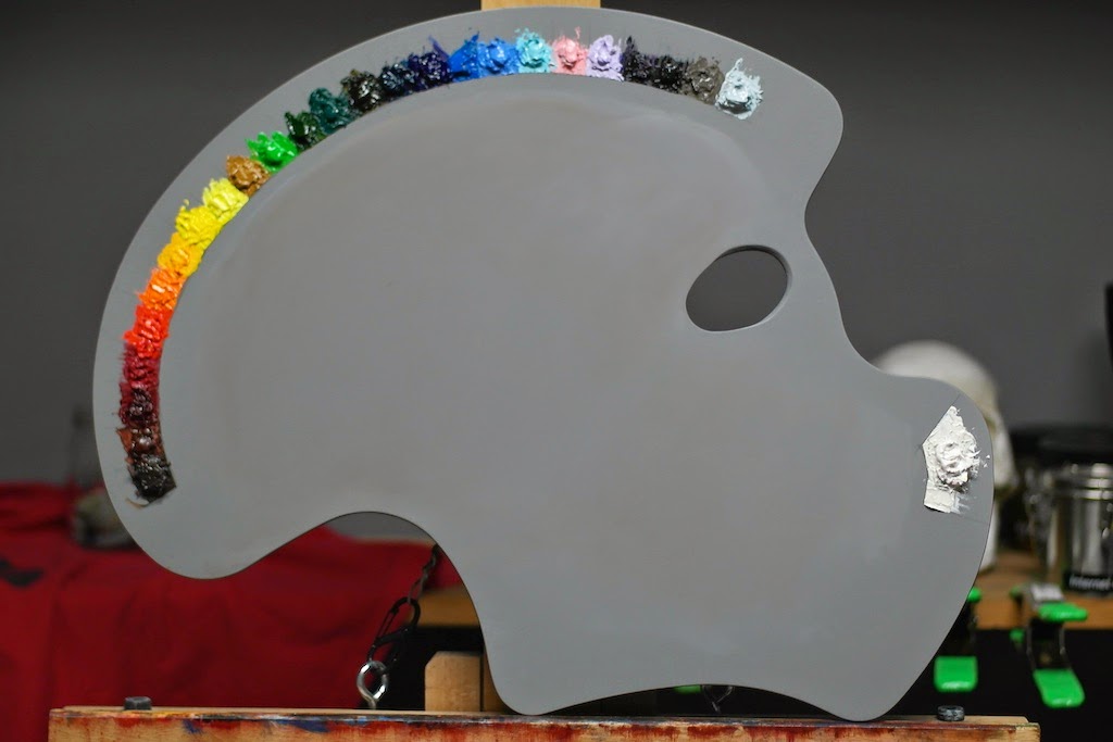
From left to right:
- Transparent Brown Oxide (Winsor &Newton)
- Transparent Red Oxide (Rembrandt)
- Permanent Alizarin Crimson (W&N)
- Quinacradone Red (Gamblin)
- Cadmium Scarlet (W&N)
- Cadmium Orange (Rembrandt)
- Cadmium Yellow Medium (W&N)
- Cadmium Yellow Pale (W&N)
- Lemon Yellow (Rembrandt)
- Yellow Ochre (W&N)
- Permanent Green (Rembrandt)
- Sap Green (W&N)
- Viridian (Rembrandt)
- Olive Green (W&N)
- Pthalo Blue Turquoise (W&N)
- French Ultramarine Blue (W&N)
- Manganese Blue Hue (W&N)
- King's Blue (Rembrandt)
- Radiant Turquoise (Gamblin)
- Radiant Red (Gamblin)
- Radiant Violet (Gamblin)
- Dioxazine Purple (Gamblin)
- Mars Black (Gamblin)
- Warm Grey (Rembrandt)
- Ice Blue (Richeson)
- Cremnitz (Lead) White (RGH Oil Colors)
I know what you're thinking: "who needs that many colors?" Honestly, no one needs that many different hues and shades on their palette. So why do I have so many? Because over the course of time, for one reason or another, I've bought various tubes of different colors of paint and have either liked them or I didn't. If I like the color and use it enough, or find a specific use for it, it earns a place on my palette, whether I use it on every painting or not.
The key to mastering an extensive palette, in my opinion, is understanding that you don't need to (and really shouldn't) use every color in every panting. Out of all those colors there are probably only about 8-10 that get used consistently. But the rest of them are nice to have when the situation does call for it.

In this close up of my most recent self portrait you can can see the all of the little color/temperature shifts made possible by the plethora of color options on my palette. I'll go more into specific colors and my thoughts and techniques on using extensive color in future posts.
Casino Near Sacramento - MapYRO
ReplyDeleteFind Casino 상주 출장마사지 Near 시흥 출장마사지 Sacramento, CA, 강원도 출장마사지 United States and explore other popular Arts 광주 출장마사지 & Entertainment activities in the United States. The property is located near Rating: 2.8 · 남원 출장안마 9 votes