Two of the most used colors on my palette are Transparent Brown Oxide and Transparent Oxide Red. I was turned to Transparent Oxide Red (TOR) in 2010 when I took a workshop with Chattanooga based painter Mia Bergeron. I had never heard of TOR nor had I used Rembrandt paints, but it was on her materials list so I picked up a tube. At first I felt that was an unnecessary purchase as the color was very similar to my go-to Burnt Sienna. However, during the workshop, my eyes were opened to the transparent properties of this color and its amazing uses. Both paints utilize the PR101 pigment - Synthetic Iron Oxide. The Winsor & Newton transparent brown oxide utilizes a linseed/safflower oil vehicle whereas, I believe, the Rembrandt transparent oxide red uses just linseed oil. I'm not positive on that one, if anyone knows for sure I'd love to hear it.
Mixed with some Ultramarine Blue, TOR makes for a great grisaille color for under paintings, but my favorite use for it is in skin tones. I am beginning to evolve away from this formula now, but for years my starting point for caucasian skin has been TOR+Viridian (another wonderful color I purchased for the same workshop) + a purple I premixed from Ultramarine Blue, Purple Lake, and white. I have since replaced the purple pre-mix with Gamblin's Radiant Violet. This basic mixture has been my jumping off point for years. I would mix a puddle of this generic skin tone and add other colors such as Cad Scarlett or King's Blue to warm/cool the color as needed. This same base color can be made with Burnt Sienna but I've found using the TOR instead leads to more vibrant, less muddy color. The TOR provides the earthy red/brown while allowing the other colors to shine through.


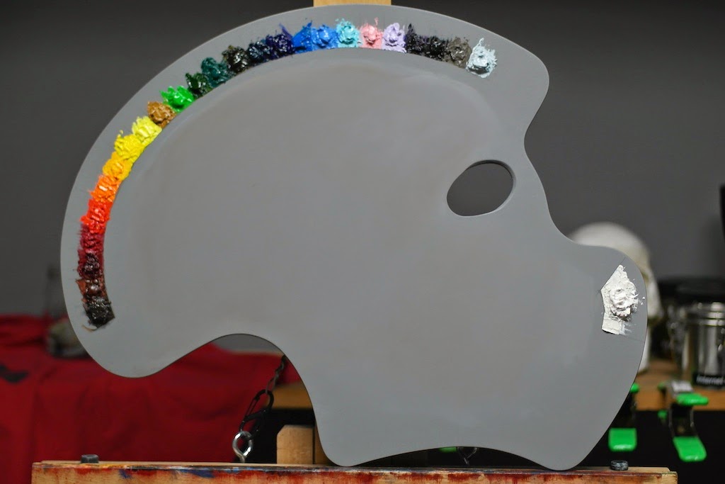
Transparent Oxide Red
Transparent Oxide Red + Viridian
Transparent Oxide Red + Viridian + Radiant Violet
Transparent Oxide Red + Viridian with Cad Scarlett (Bottom) and King's Blue (top) mixed to shift temperatures.
I started using the Transparent Brown Oxide about a year ago when I started painting with my friend and teacher Seth Haverkamp. Unlike the TOR, I rarely use TBO in any color mixes. I use it almost exclusively for my grisaille under drawing. Essentially it took the place of the TOR+Ultramarine Blue mix I had been using. I made the switch for two reasons: 1) the TBO is about $6 a tube vs. the TOR which is closer to $12, and 2) it dries ridiculously quickly. Both of these reasons make it perfect for the initial drawing. After completing the drawing I'll continue using the TBO to darken (yet keep transparent) the shadow areas of a painting but, again, I rarely use it in mixes. Mixing this brown in typically leads to dull, muddy colors in my opinion.

Grisaille done using Transparent Brown Oxide for the drawing and shadows, mix of lead white and Transparent Oxide Red scumbled in the lights.
* A note on brands: I continue to use Rembrandt brand Transparent Oxide Red since I'm really happy with the paint quality and texture. I initially used Rembrandt's Transparent Brown Oxide also, until I realized how quickly I went through a tube. The quality was great, but its a series 3 (I believe) which puts it close to $12 or $13 a tube. I have since switched to Winsor & Newton's Transparent Brown Oxide (series 1, $6) and I'm just as happy with it.